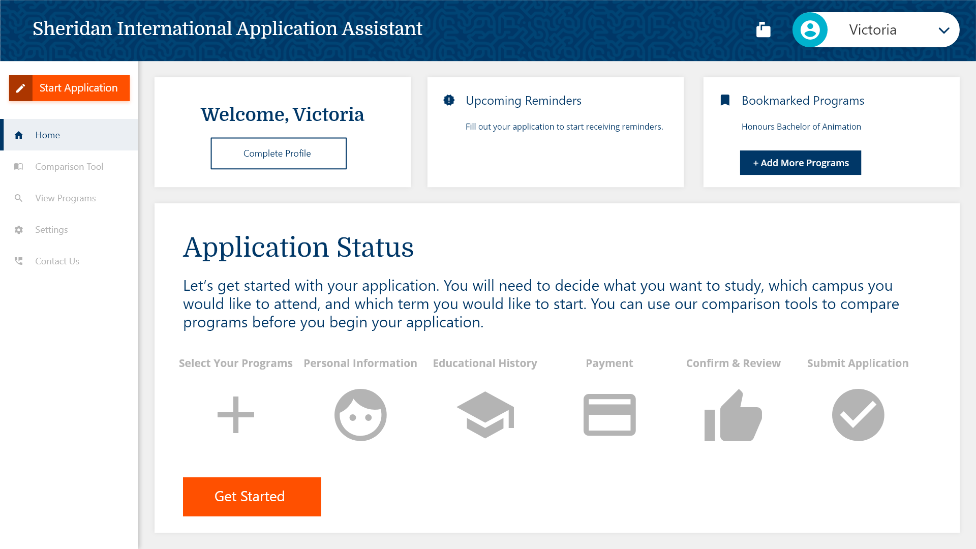
International Application Assistant (SIAA)
Fall 2017 - UX Research / Design
Team: Christina Weng, Jordan Akin, Timmy Chu, Wesley Slade
Role: UX Research / UX Design
What is SIAA?
SIAA is a browser-based service designed to make applying to Sheridan College an intuitive, accessible, and feedback-driven process for international students and educational agents.
On this project I served as one of the lead UX researchers and designers. I conducted most of the interviews and worked heavily on refining the resulting insights, design requirements, and userflows. The digital wireframes, visual design, and the interactive prototype itself were worked on by Christina Weng.
Background
Sheridan College sought to update its application process for international students. Its current digital portal has received criticism for accessibility issues, confusing UI, and incorrect / redundant instructions throughout the application process. All of these issues make for a frustrating user experience that damages the reputation of Sheridan College and discourages prospective students from applying.
Formative Research
Usability Heuristics Analysis
Our team began by reviewing Sheridan's existing portal for international students using Usability Heuristics. We identified numerous issues that we judged required a complete rebuild of the portal. During this review we also took time to formulate questions about the existing portal for Sheridan Staff and international students who've used it.
Semi Structured Interviews
Interviewing actual users of the portal was crucial to understanding their needs and pain points during applying. We conducted 30-40 minute interviews with students who had used the existing portal. We asked them both about the actual user experience of using the current portal and about their entire journey from pre-application to post-application.
Expert Interviews
We spoke to one of the administrators of the Sheridan International Office who gave us additional insights on the application process.
Insights
Application Process & Student Journey
In most cases, students start the process of studying abroad long before they apply to Sheridan and it can continue for months after they submit their application online. The portal itself is a singular step in that process and currently doesn't support or recognize many of the challenges that prospective students may have.
The Existing Portal
The existing portal has numerous systemic issues plaguing both the overall experience and individual website elements or user interactions. Many of these problems are pain points for both students, educational agents, and even Sheridan Staff.
Language Barriers
The current system offers limited, sometimes incorrect, instructions to users as they go through the process. The resulting user inputs can result in significant delays while the mistake is corrected either by the applicant or administrator later in the process.
Confusing Interfaces
Without a doubt, the current portal lags behind universal standards in web and service design. Students spoke about immense confusion and anxiety while attempting to complete the application process.
Specifically of note is a warning modal UI that informs users that they only have 15 minutes to complete the application. When we inquired as to why this time limit is necessary or required, we were told by the international office that this element is "broken" and there is no actual time-limit, nor does is any system action taken upon the time expiring.
HMW Statement
How might we design an intuitive, accessible and feedback-driven application platform for international applicants of Sheridan College.
User Personas & Behavioral Mapping & Context Scenarios
Our work now shifted to understanding the needs of our users for the new system / portal.
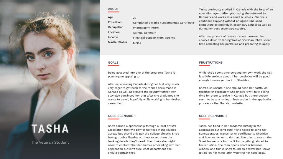
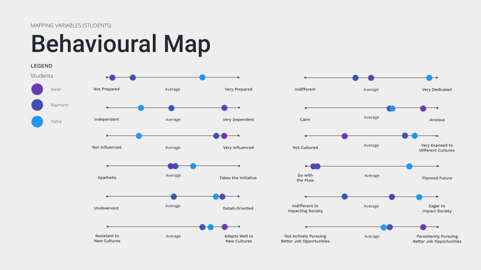
We created 8 user personas (6 primary & 2 secondary) and placed them on a behavior map with archetypical traits we had analyzed in our primary research.
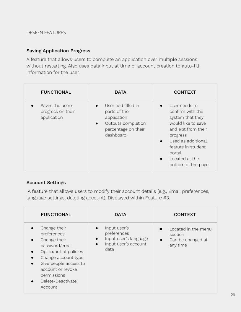
Design Requirements & Features
In our design requirements we broke down the specific features of our context scenarios to their functional, data, or contextual needs.
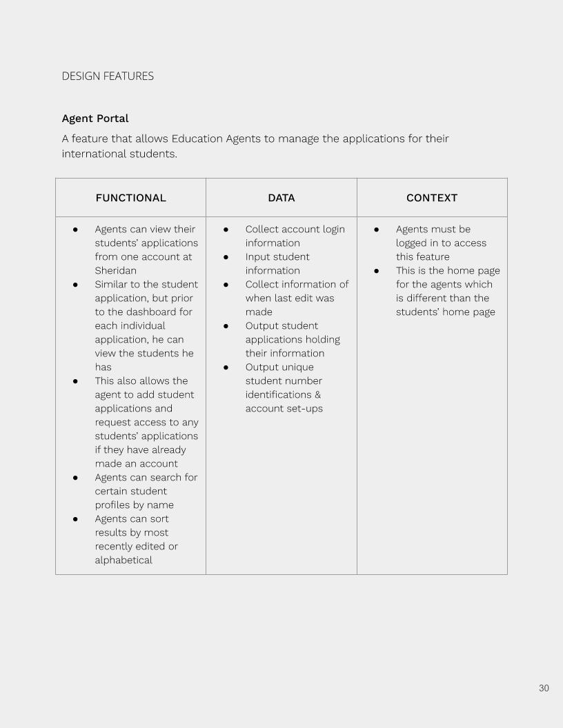
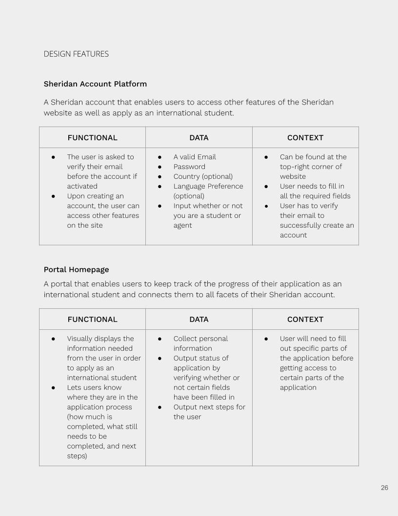
From there, we started working out the larger userflows of the system, creating wireframes and userflows on paper and then recreating them in Adobe XD.
Interactive Prototype
The interactive prototype was created in Adobe XD has two implemented user experiences: A student who is applying by themselves and an educational agent who is managing the application of a student client